Part 2 of a series on data visualisation styles. Previous post: Governing data visualisation consistency – Why visual consistency isn’t enough in self‑service reporting.
The data visualisation standard is a formal document that states the mandatory requirements for visualising data within an organisation. The document leads to enhanced report user experience and accelerated report development.
Furthermore, when defined up-front in an enterprise reporting program of work, it can help ease report adoption amongst consumers and establish an overarching enterprise reporting governance model.
What goes in?
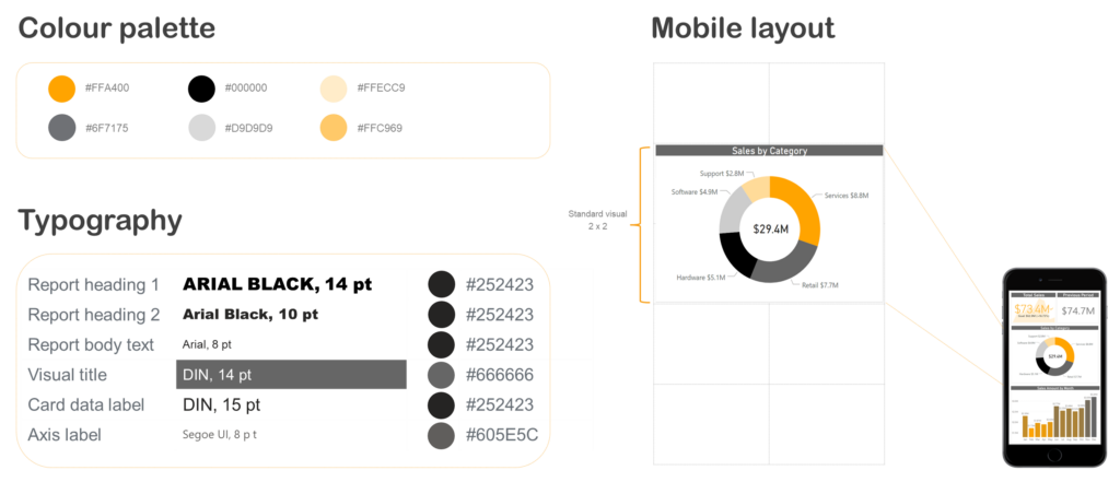
This document is not a one-size-fits-all approach for organisations but typically includes visual standardisation across the following aspects:
- Colour palettes, typography and iconography
- Buttons and hyperlinks
- Headers and footers including logo positioning
- Contextual information including audience, purpose and data sources
- Standard report layouts, which can be broken down by:
- Device (desktop, tablet, mobile…)
- Organisational area
- Report type (exploratory, dashboard…)
Standards vs guides
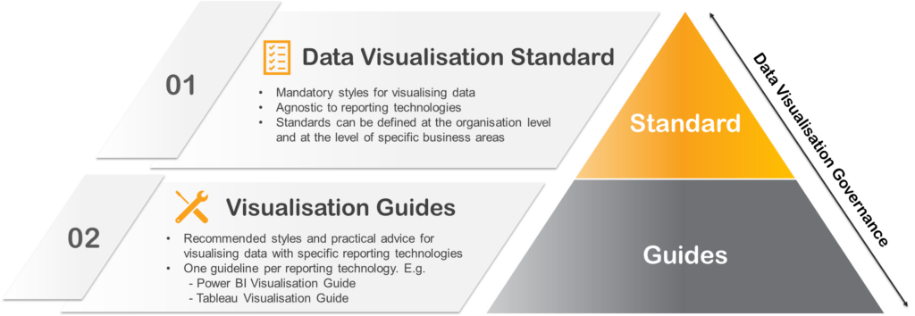
Although this blog focuses on the data visualisation standard, a set of complementing governance documents may be used, as illustrated in the diagram below. The top-level represents the data visualisation standard, which will typically be a single document that is technology agnostic and will define the mandatory data visualisation requirements. Its purpose is to drive overall visualisation consistency across the organisation, where consistency should exist.
The bottom level represents the technical visualisation guides. These documents offer data visualisation recommendations and best practices specific to technologies such as Power BI and Tableau. In addition to driving consistency, these documents can help accelerate the visual design of reports.
Summary
This data visualisation standard is a tool that can help organisations with the governance of modern self-service reporting tools. In another blog, I’ll share practical advice on how a Power BI visualisation guide can be used to accelerate report design.